U Are...
Website design | Graphic design | Brand Collateral | Visual Guidelines | Art Direction | Video
Printed Promotional material | Logo desing
Printed Promotional material | Logo desing
Project Overview:
Organic Juice - U are Happy Life Zen Glow :)
Organic Juice - U are Happy Life Zen Glow :)
Role: Creative Director & Product Designer
As the Creative Director and Product Designer for the Organic Juice brand " U ARE " I was tasked with creating a unique product that stands out in the competitive market by blending visual appeal with nutritional benefits.

Product Concept
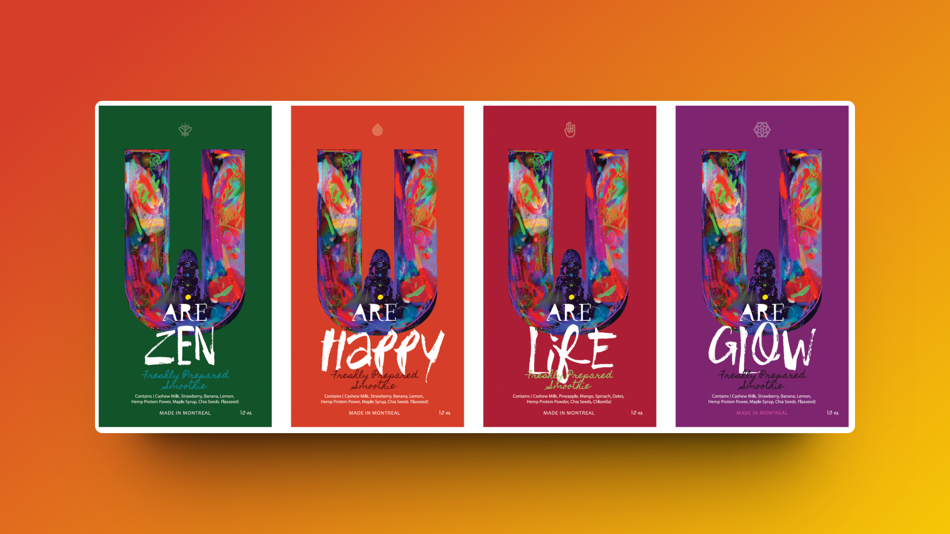
Connecting Colors with Chak-ras:
The concept behind "U Are" is to differentiate the product by using the native colors of its main ingredients, each corresponding to the colors of the chakras. This signature approach symbolizes the connection between color and emotions, bridging the spiritual and materialistic worlds, making it easy for customers to recognize and select.
Color and Emotion:
Each juice variant is designed to evoke specific emotions and resonate with the spiritual aspects associated with its corresponding chakra color.
Each juice variant is designed to evoke specific emotions and resonate with the spiritual aspects associated with its corresponding chakra color.
Brand Recognition:
The distinct color-coding helps customers easily identify and choose their desired juice variant on the spot.
The distinct color-coding helps customers easily identify and choose their desired juice variant on the spot.

Marketing Strategy
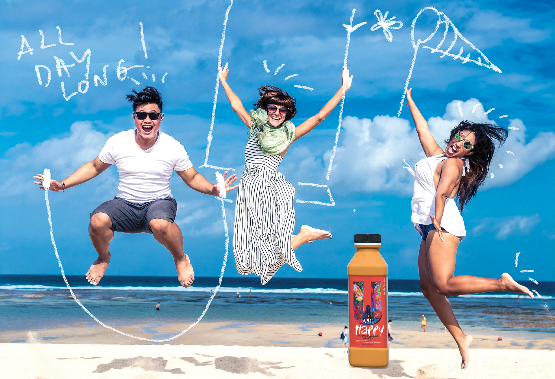
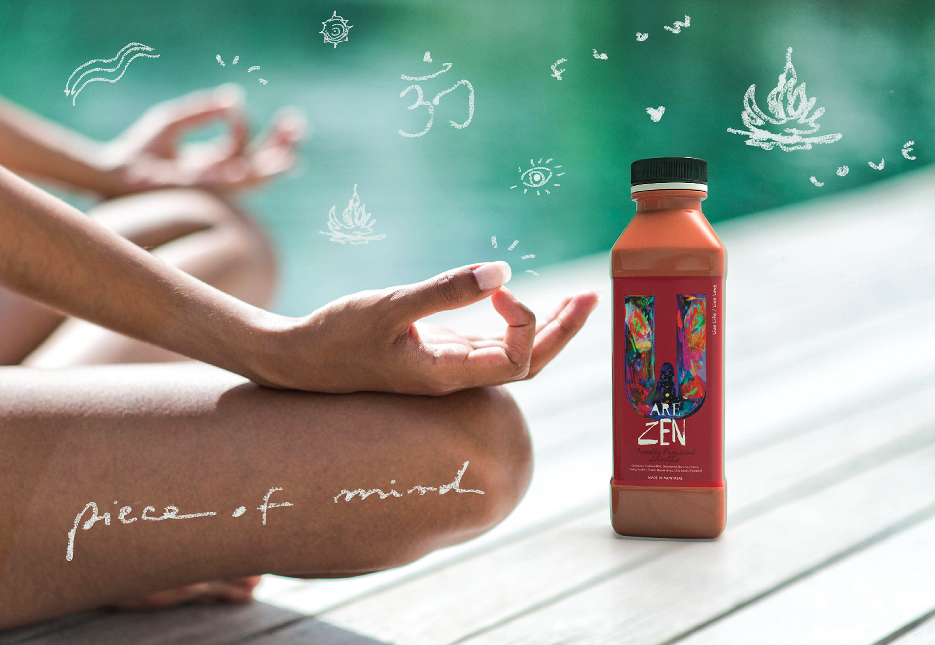
Eye-Catching and Informative Campaign:
The marketing strategy aimed to highlight the unique aspects of "U Are," focusing on its visual appeal, nutritional benefits, and the convenience it offers.
The marketing strategy aimed to highlight the unique aspects of "U Are," focusing on its visual appeal, nutritional benefits, and the convenience it offers.
Multichannel Approach:
Utilizing various platforms, including social media, print ads, and in-store displays.
Utilizing various platforms, including social media, print ads, and in-store displays.
Visual Consistency:
Maintaining a consistent theme that emphasizes the chakra colors and their associated benefits.
Maintaining a consistent theme that emphasizes the chakra colors and their associated benefits.
Target Audience:
Aimed at health-conscious individuals, active lifestyles, and those seeking convenient yet nutritious options.
Aimed at health-conscious individuals, active lifestyles, and those seeking convenient yet nutritious options.
Design and Packaging
Practical and Appealing Design:
The size and content of the juice bottles were crucial considerations to ensure convenience and practicality, especially for active lifestyles.
The size and content of the juice bottles were crucial considerations to ensure convenience and practicality, especially for active lifestyles.
Portable Size:
Designed for ease of carrying, whether for jogging or daily commuting, fitting perfectly in bags.
Designed for ease of carrying, whether for jogging or daily commuting, fitting perfectly in bags.
Nutrient-Rich Content:
Each bottle contains 9 grams of protein, minerals, antioxidants, vegetable fibers, Omega-3 superfoods, keeping consumers energetic, focused, and stable throughout the day.
Each bottle contains 9 grams of protein, minerals, antioxidants, vegetable fibers, Omega-3 superfoods, keeping consumers energetic, focused, and stable throughout the day.
Key Elements of the Campaign
1. Digital Media:
Social Media Ads: Created vibrant and engaging posts and ads for platforms like Instagram, Facebook, and Twitter, highlighting the product's unique color concept and health benefits.
Website and Blog: Developed content that educates consumers on the connection between chakras and the juice colors, the nutritional benefits, and usage tips.
2. Print Media:
Posters and Flyers: Designed visually appealing posters and flyers for display in health food stores, gyms, and wellness centers.
3. In-Store Displays:
Product Stands: Created eye-catching stands that showcase the different juice variants, emphasizing their unique colors and benefits.
Impact
Establishing a Unique Market Presence:
My work resulted in a distinct and memorable brand identity for
"U Are" that effectively communicates its unique selling points. The combination of visually appealing design, nutritional benefits, and practical packaging has positioned "U Are" as a preferred choice among health-conscious consumers.
The chakra-based color concept not only differentiates the product in the market but also creates an emotional connection with customers, enhancing brand loyalty and recognition.